Human Capital Analytics | How to Harness the Potential of Your Organization's Greatest Asset by Gene Pease, Boyce Byerly & Jac Fitz-enz
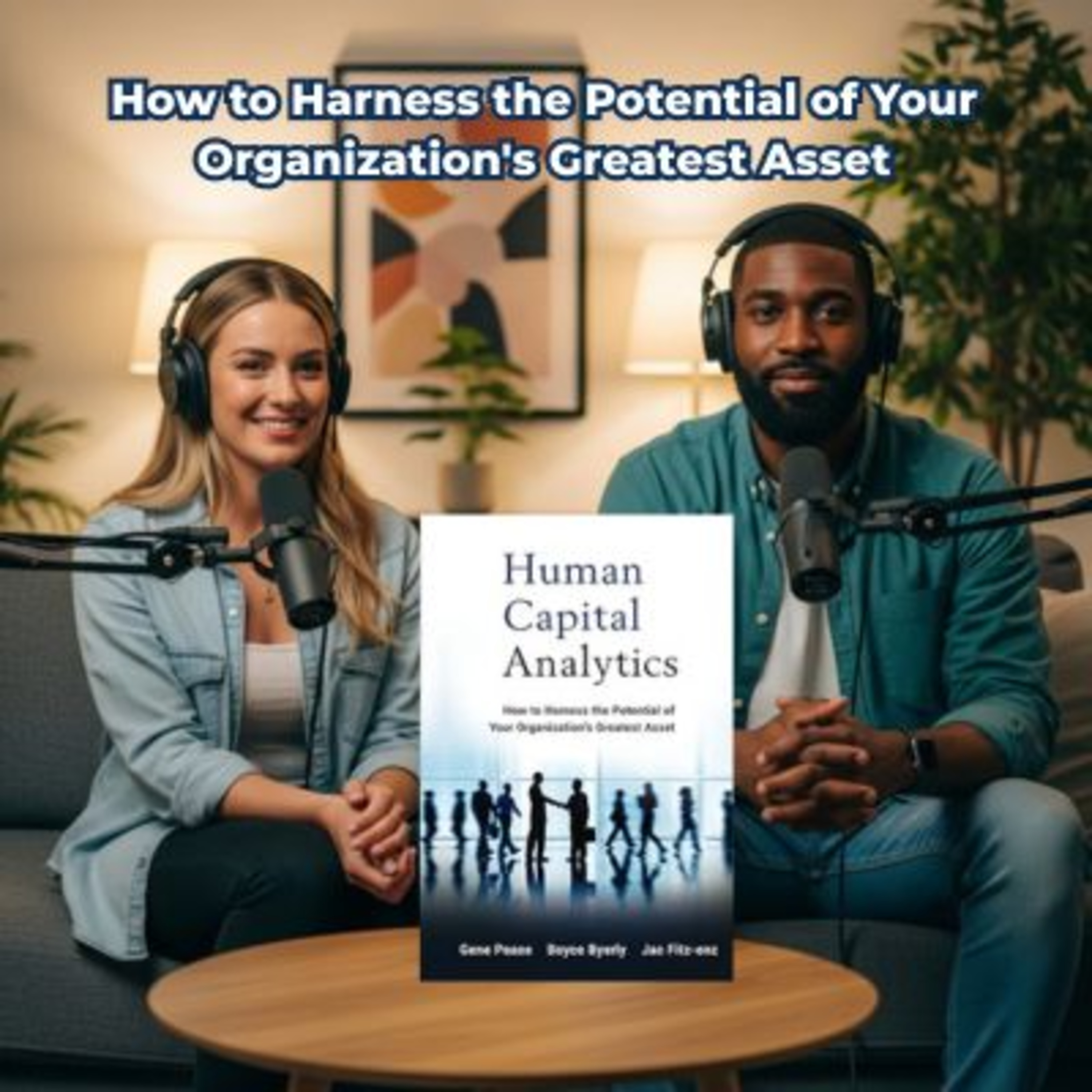
Human capital analytics, also known as human resources analytics or talent analytics, is the application of sophisticated data mining and business analytics techniques to human resources data. Human Capital Analytics provides an in-depth look at the science of human capital analytics, giving practical examples from case studies of companies applying analytics to their people decisions and providing a framework for using predictive analytics to optimize human capital investments.
- Written by Gene Pease, Boyce Byerly, and Jac Fitz-enz, widely regarded as the father of human capital
- Offers practical examples from case studies of companies applying analytics to their people decisions
- An in-depth discussion of tools needed to do the work, particularly focusing on multivariate analysis
The challenge of human resources analytics is to identify what data should be captured and how to use the data to model and predict capabilities so the organization gets an optimal return on investment on its human capital. The goal of human capital analytics is to provide an organization with insights for effectively managing employees so that business goals can be reached quickly and efficiently. Written by human capital analytics specialists Gene Pease, Boyce Byerly, and Jac Fitz-enz, Human Capital Analytics provides essential action steps for implementation of advanced analytics on human capital.
This episode summarizes a strategic framework for human capital analytics, illustrating how organizations can transition from basic data collection to sophisticated workforce insights. This roadmap emphasizes the Human Capital Analytics Continuum, which guides managers through the progression of integrating simple metrics with complex performance drivers. Successful implementation requires strategic alignment between stakeholders and a structured Measurement Plan to ensure data collection serves specific corporate goals. The source further highlights the importance of balancing qualitative and quantitative data to uncover the narratives behind organizational trends. Finally, the text explores the utility of visual dashboards as essential tools for monitoring real-time performance and identifying areas for improvement. By following these principles, leaders can move beyond guesswork to foster a more productive and engaged work environment.
#HumanCapitalAnalytics #HRAnalytics #BusinessIntelligence #DataDrivenLeadership #PeopleAnalytics #Leadership #BusinessStrategy #WorkforceManagement #FutureOfWork #OrganizationalDevelopment #BusinessPodcast #ManagementStrategy #DataAnalytics #EmployeeEngagement #BookSummary
Why do companies with, like, absolute mountains of employee data still completely fail to predict when their top performers are about to quit? Right? I mean, we just assume that managing people involves this, this inescapable, murky guesswork, you know? Yeah, exactly. We collect all these spreadsheets and time cards and performance reviews, but so many leaders are still just flying completely blind when it comes to predicting human behavior in the workplace. Because we are drowning in data but starving for actual insight.
I mean, we track everything, right? But we understand very little about the actual mechanics of our own workforces. Which is exactly what we're fixing for you today. We are pulling from some incredibly insightful excerpts from the book Human Capital Analytics. The data-driven road map to performance. By Gene Peas, Boyce Byerly and Jac Fitz-enz and the mission for this deep dive is to move you from just guessing about your team's performance to actually knowing the hidden levers that make them tick.
And this matters deeply to you, the listener, you know, regardless of your scale, whether you are steering a massive corporate department across multiple continents or you're just trying to optimize a a lean startup team. Yeah, transforming that raw, dormant information into a predictive understanding of human capital is, well, it's the ultimate competitive advantage. OK, let's untack this human caital analytics, right? The authors frame this not as some dry HR administrative chore, but as a secret weapon, like it is a rigorous tool for unlocking a team's absolute maximum potential.
Yeah, but they make it clear that you don't just, you know, suddenly buy a software tool and achieve enlightenment. I wish, right? There is an evolution involved, which they call the Human Capital Analytics continuum. Continuum, yeah. So what does that actually look like on the ground? Well, the word continuum implies a necessary journey. Most organizations are trapped at the very bottom of this continuum. Like the absolute baseline. Exactly. They're in the basic data phase. They track attendance records, basic performance indicators, turnover rates, they note who showed up and whether they hit their quota.
And that is just baseline reporting. Yeah, the source material gives a great example of a developing business that's experiencing high employee turnover, a manager operating at that bottom tier of the continuum. They just look at the Ledger and note the attrition. Right, just counting. Yeah, like Sarah left, John left. They are really just tallying the casualties. And what's fascinating here is how moving up the continuum requires this massive psychological and technical shift. ISO Well, you have to start correlating disparate data points that live in completely different departmental silos.
Oh, I see. So instead of just noting the turnover, an advanced analytics approach connects that attrition rate to other internal ecosystems. Like what? Say, job satisfaction surveys or the roll out of recent training initiatives. Oh, right. When you bridge a gap between those different databases, a completely different narrative emerges. Right, like in the books example, they discovered that employees aren't just leaving randomly and they aren't even leaving for better pay. They're leaving because they feel under trained and completely overwhelmed by like new software platforms.
Which is an entirely fixable problem. Exactly. But you only see that solution if your data architecture allows your HR turnover metrics to actually talk to your learning and management system logs. Yeah, they have to communicate and. Companies get trapped in the baseline phase simply because it is psychologically comfortable. I mean, counting turnover is easy. Right, it's just a number. But hunting for root causes requires vulnerability. It forces a leader to look at a symptom like high attrition and ask what systemic failure in our training pipeline caused this.
Here's where it gets really interesting though, if baseline data collection is like looking at a thermometer to see if you currently have a fever. Oh, I like that. Right, Moving up this continuum is like having a predictive weather radar. You're shifting from a reactive stance, like acknowledging that it is currently raining, to a proactive stance where you see a low pressure system forming off the coast and you start handing out umbrellas before a single drop falls. To achieve that predictive state, you have to build an infrastructure where your data isn't just a historical record, it becomes an active diagnostic tool.
You're creating a unified view of the entire employee experience. Exactly. But I mean, moving up this continuum and bridging all those departmental databases. That isn't something one rogue data scientist or HR manager can just do in a vacuum. No, definitely not if. You want to cross reference all these different departments. You need those departments to actually cooperate. Which is notoriously difficult. Yeah, understatement of the year. Right. The authors use a very evocative analogy here to explain the solution.
They compare organizational cooperation to tuning a corporate band. Tuning the band? Yeah. If you were going to play a Symphony, every single musician has to be playing the identical TuneIn unison, perfectly in tune with one another. In our context, this concept is called alignment. Alignment and the book outlines what happens when you try to introduce, say, a new performance evaluation system or a brand new training initiative without that alignment. It's chaos. Complete chaos. You can't just drop a new initiative on an organization to start measuring it.
You have to hold a workshop first with your key stakeholders. Your finance folks, Team leaders, Operations executives. Right to define what success actually looks like for this specific intervention. Because if you don't define success mutually upfront, every department will judge the data through their own bias lens, right? Of course. I mean, are we trying to enhance worker competencies and long term innovation or are we just trying to increase raw short term output? OK, wait, let me push back on this a little bit.
Sure, because alignment workshops sound incredibly neat and tidy in theory. In theory, yes. But in the real world, if this is a band, what happens when finance wants to play heavy metal like ruthless cost cutting, slash and burn margins and team leaders want to play smooth jazz? Smooth. Jazz. Yeah, you know, employee Wellness, unlimited PTO, and long term retention. In a corporate hierarchy, finance usually holds the purse strings. So how do you practically force alignment when the underlying departmental incentives are entirely at odds?
Well, if we connect this to the bigger picture, the goal of an alignment workshop isn't to force the CFO and the HR director to share the same overarching philosophy on corporate. Wellness, it's not. No, it is to force an agreement on what specific song is being played right now. For this specific project, it is about establishing the parameters of a single experiment. Oh, OK. So you isolate the initiative from the broader departmental turf wars? You have to. If you launch a new leadership training module and finance assumes the metric for success is a 10% reduction in middle management headcount within six months.
Yikes, right? While HR assumes the metric for success is a 20% boost in team morale scores. Your data collection is going to be completely schizophrenic. Because you're gathering metrics that talk past one another. Exactly. The alignment process forces the CFO and the HR director to look at the same whiteboard and agree OK for this specific training success means a 15% faster resolution time on customer support tickets. And once that singular unified goal is written on the whiteboard, nobody can move the goal posts later when the data actually starts rolling in.
That is the crucial mechanism of alignment. It prevents structural miscommunications and ensures the data gathered actually advances a shared corporate objective. Instead of just satisfying one department's isolated agenda. Right. Without it, you end up with brilliant, mathematically lawless data that absolutely nobody acts on. Because it doesn't answer the questions that the opposing stakeholders actually care about. Precisely. OK, so you've tuned the band. Everyone agrees on the song they want to play, but they still need the actual sheet music to read from.
Yes. And in Human Capital Analytics, that sheet music is your measurement plan. The measurement plan is your ultimate structural guide. It dictates what you're going to measure, how you're going to capture those metrics, and crucially, why those specific results matter to the aligned goal you just set. The how, the what and the why. Exactly. The authors use the analogy of a road trip map. You wouldn't just start driving blindly toward a destination. You plot the route, the milestones and the hazards.
So what does this all mean? To me it feels closer to an architect's blueprint. Oh, a blueprint. Yeah, like you would just start pouring concrete and hammering wood together hoping a functional building emerges. Definitely not. You have to know if you're building a backyard shed or a 60 story skyscraper before you order a single pound of materials, and the measurement plan prevents you from hoarding random useless materials. A blueprint is the perfect way to visualize it. The book gives a few concrete examples of how these blueprints are drawn up.
Let's look at an onboarding initiative for new hires. OK, an aligned organization wants new employees to become profitable contributors faster. So the measurement plan outlines the exact data sources first. Like where's the information coming from? Yes, in this case, surveys from the new hires and output records from their managers. Then it outlines the targets right? Like quicker ramp up times. But the most important part of the blueprint is defining the actual measurements. How so? Well, how do we mathematically define time to productivity?
Is it the number of days until a new sales Rep closes their first deal? Is it the weeks it takes for a new software engineer to commit code without generating a bug? Right, you have to define the metric with absolute precision. Another example from the source material is a leadership development program. Yes, that's a good one. The overarching goals are enhanced teamwork and better leadership capabilities, so the measurement plan dictates that you will monitor performance ratings and aggregate 360 degree employee feedback.
Comments. Both before the training and at a specific interval after the training, the discipline of the measurement plan maintains the relevance of your analysis. Too many organizations fall into the trap of measuring something simply because their software makes it easy to measure, not. Because it actually correlates to business value. Exactly. They track how many hours employees spend logged into a training portal, rather than tracking if that training changed the employees behavioral output on the factory floor.
Yeah, that makes so much sense. The blueprint forces you to only collect the data that spurs advancement. It keeps you entirely focused on the raw materials you actually need. Which brings us to the train itself. You have your blueprint. You know what you want to build. Now you have to look at the materials you are gathering to build it. Yes, the authors call this phase the data recipe. The book explicitly uses a culinary analogy here. Different ingredients go into a finished cuisine and in Human Capital Analytics you are blending 2 distinct types of ingredients.
Quantitative data and qualitative data. And the mastery isn't in collecting them, the mastery is in managing the friction between them. I mean, we all know the difference between the hard numbers and the subjective feelings. That's true. The quantitative is your turnover rates, your output volume, your salary bands. The qualitative is the nuance, the open-ended feedback, the tone of an exit interview, the culture surveys. And the source text gives a highly revealing example of why blending these is non negotiable.
Let's hear it. Imagine a business aggressively trying to increase employee retention. If their analytics team only looks at the quantitative stats, they just see a massive spike in turnover within a specific department. They see the leak in the boat. Right, and the default quantitative driven assumption is almost always compensation. Oh, they must be leaving for more money. Because numbers equals money, usually. But when they sold in the qualitative data from the exit interviews, a completely different narrative takes shape.
Exactly. The root cause isn't pay at all. The qualitative feedback reveals A systemic lack of career advancement opportunities. People are leaving because they feel professionally landlocked. And that requires A dramatically different strategic response. Oh, for sure. If you only trusted the quantitative numbers, you might authorize a massive budget increase, give everyone a 10% raise, and then watch in horror as your top performers continue to leave six months later because they are still bored.
Wait, let me challenge the reliability of that qualitative data for a moment. OK, go for it. Because qualitative data relies on human honesty, and the workplace is inherently political. If you have an employee doing an exit interview, couldn't they just be giving a polite, socially acceptable answer to avoid burning bridges? Yes, absolutely. Like if the company culture is toxic, they aren't going to say my manager is a tyrannical nightmare. They're going to give evasive qualitative data. They'll say, oh, I'm just seeking new challenges, right?
So how does an analytics model catch a polite lie? Well, this raises an important question about psychological safety and data validity. You are entirely correct that qualitative data can be defensive or evasive, but this is exactly why the blend of quantitative and qualitative is so vital. They act as a cross examination mechanism. The friction between the two sets of data is often the most revealing metric of all. Walk me through that. How does the friction reveal the truth? So quantitative data tells you that there is a leak and the precise volume of water coming in.
Qualitative data attempts to tell you why. But if the quantitative data shows a massive localized 40% turnover rate strictly under one specific mid level manager. Oh well. Right. And the qualitative exit interviews from those specific departing employees all feature vague, overly polite platitudes about seeking New Horizons. That contradiction is your data point. Wait, so the variance itself flags the lie? Precisely the mathematical reality of the mass exodus contradicts the polite fiction of the exit interviews.
That is wild. An advanced analytics team looks at that friction and instantly diagnosis a culture of fear. They realize the manager isn't just driving people away. The manager is so toxic that departing employees are terrified to even leave a paper trail on their way out the door. Oh, that makes so much sense. You need the hard numbers to stress test the subjective narratives. That completely changes how you view a data set. The contradictions aren't errors, they are signposts. Yes. So you've done the incredibly hard work.
You've moved your organization up the analytics continuum, you forced the finance and HR teams into alignment, you've architected A precise measurement blueprint, and you are expertly cross examining your qualitative and quantitative data. You've got it. All, you now possess A profound multidimensional understanding of your workforce. But having that understanding and successfully communicating it to the rest of the leadership team are two entirely different challenges. Which brings us to the delivery mechanism.
How do you serve this incredibly complex, nuanced intelligence so that a busy executive or a frontline team leader can actually digest it and act on it instantly? The answer, according to the source material, is the dashboard. The authors describe dashboards as graphic tools that facilitate the immediate understanding of complex blended data. The analogy they use is a car's control panel. The dashboard in your car, Yeah. When you are merging onto a highway at 70 miles an hour, you cannot process a raw data feed of your engines combustion statistics, your fuel injection rates, and your tire pressure variables.
No, you would. Crash. Exactly. You need a centralized gauge that synthesizes all that complexity into three simple things, your speed, your fuel level, and your engine temperature. I think about it like wearing a smartwatch during a marathon. Oh, that's a good one too. Yeah, I'm exerting maximum physical energy. My cognitive load is maxed out, just focusing on the road ahead. I don't want to open a mobile app and read a scrolling raw spreadsheet of my millisecond by millisecond heart rate logs. No one wants that.
Right, I just want to glance at my wrist and see a simple color-coded ring. Green means I'm in the optimal zone. Red means I need to slow down or I'm going to collapse. Dashboards serve that exact cognitive function for business metrics. They utilize API feeds and data lakes to pull in thousands of data points in real time, but they only visually display the synthesized outcome. The synthesis is key. The design of a dashboard is entirely about reducing the cognitive load on the decision maker. But I mean, I've seen corporate dashboards that look like the cockpit of a space shuttle.
Just charts and graphs piled on top of each other. And those are failed dashboards, really. Absolutely. A dashboard fails when it tries to show everything rather than showing what matters. Remember the alignment phase and the measurement plan. Yeah, the blueprint A. Successful dashboard only visualizes the specific metrics you decided were crucial back in that blueprint stage. That makes a lot of sense. The source material gives a really compelling example of a sales performance dashboard designed the right way.
It contrasts the output and engagement metrics of various sales squads across the country. Right, the anomaly tracker. Yeah, the dashboard is designed to highlight anomalies. Suddenly, the executive sees a massive visual spike. One specific squad in one region is vastly outperforming the rest of the country. The dashboard doesn't necessarily tell you every granular detail of what that squad is doing. No, of course not. Its job is to act as a flare gun. It highlights the outlier immediately, prompting the leadership team to zoom in, investigate the localized tactics that team is using, and then reverse engineer that success to train the rest of the company.
It strips away the noise of the average performers and forces your attention directly onto the anomaly. It gives leaders their time and their clarity back. You can monitor progress against your strategic targets without getting bogged down in the microscopic details of the raw data. Bringing this all together for you, the listener, if you take away anything from this deep dive, is that managing human beings does not have to be an exercise in gut feelings and guesswork. It really doesn't. Moving your team from baseline tracking to this level of sophisticated, aligned analytics is the bridge to building a truly engaged, highly optimized workplace.
And the profound take away from human capital analytics is that this process isn't about reducing your human workforce to cold numbers on a spreadsheet. It is the exact opposite. When executed correctly, human capital analytics is the ultimate act of empathy. Empathy, yeah. It is about utilizing data to genuinely understand the frustrations, the roadblocks, and the untapped potential of the people who make your organization function. It's about while turning the lights on so you can actually see the people in the room with you.
But as we wrap up, I want to leave you with one final unscripted thought to Mull over. OK, we have spent this entire session exploring how to brilliantly quantify human capital. We have blueprints, We have data recipes, we have beautifully synthesized dashboards. We. Have all the tools. But if we successfully quantify human behavior to this incredible mathematical extent, we'll where does human intuition fit in? That is the ultimate tension of modern leadership. Right. I mean, if you're Florida State aligned, rigorously measured dashboard tells you to take one specific action, say pivoting a successful product line or letting go of an underperforming but culturally beloved employee, but your gut built on 20 years of lived, unquantifiable industry experience, it screams the exact opposite.
What do you do? It's a tough call. At what point does being entirely data-driven run the risk of making U.S. data blind to the unpredictable magic of human potential? It's a question every leader eventually has to answer for themselves when the numbers and their instincts collide. Definitely something to seriously think about the next time you're staring at a perfectly formatted dashboard trying to decode the wonderfully murky, beautifully complex machinery of human beings. Thanks for joining us on this deep dive.
We'll catch you next time.
 Apple Podcasts
 Castbox
 Castro
 Goodpods
 Moon FM
 Overcast
 Pocket Casts
 Podbean
 Podcast Addict
 Podcast Republic
 Spotify