Five Rules from The Design of Everyday Things by Don Norman
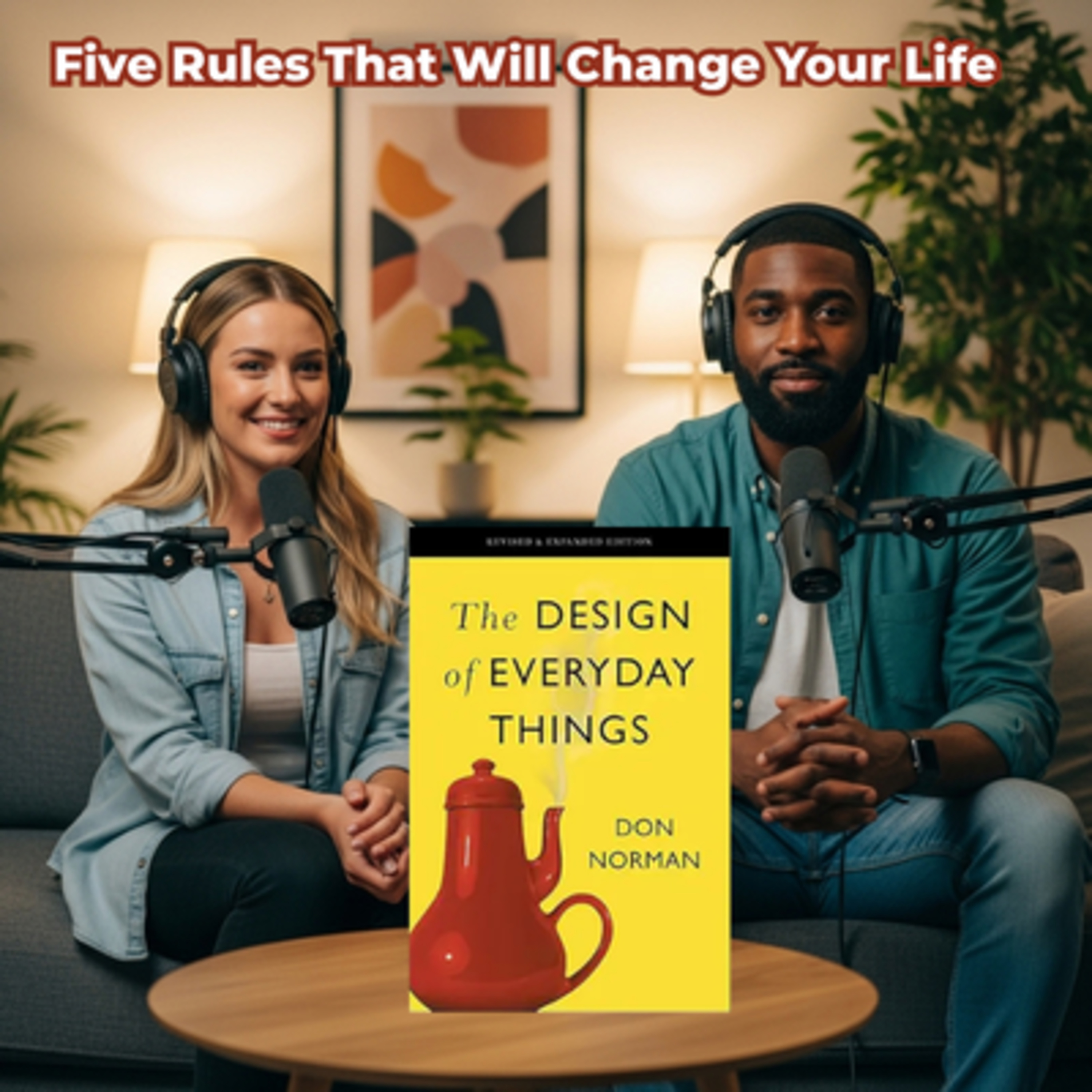
This episode highlights the fundamental principles of user-friendly design as explored in Don Norman’s seminal work. It emphasises that human-centred creation ensures products are intuitive, reducing consumer frustration by aligning with natural psychological expectations. By effectively using visual cues and physical constraints, designers can guide users toward the correct actions while minimising the potential for mistakes. The source also notes that immediate feedback and error tolerance, such as an "undo" function, are essential for building user confidence. Ultimately, the overview suggests that thoughtful design simplifies life by reducing the mental effort required to interact with everyday objects.
One of the world's great designers shares his vision of "the fundamental principles of great and meaningful design", that's "even more relevant today than it was when first published" (Tim Brown, CEO, IDEO).
Even the smartest among us can feel inept as we fail to figure out which light switch or oven burner to turn on, or whether to push, pull, or slide a door.
The fault, argues this ingenious -- even liberating -- book, lies not in ourselves, but in product design that ignores the needs of users and the principles of cognitive psychology. The problems range from ambiguous and hidden controls to arbitrary relationships between controls and functions, coupled with a lack of feedback or other assistance and unreasonable demands on memorization.
The Design of Everyday Things shows that good, usable design is possible. The rules are simple: make things visible, exploit natural relationships that couple function and control, and make intelligent use of constraints. The goal: guide the user effortlessly to the right action on the right control at the right time.
The Design of Everyday Things is a powerful primer on how -- and why -- some products satisfy customers while others only frustrate them.#productivityhacks #personaldevelopment #successstrategies #businessinsights #leadershipskills #leadership #ambitiousprofessionals #businesstips #self help #scaling business #businesstactics #professionaldevelopment #startupgrowth #entrepreneurship #businessmindset #growthstrategies
OK, so let's unpack this. I mean think about the last time you got a new gadget, maybe a smart thermostat or some piece of software that was supposed to make your life simpler and you felt that. You know the immediate flash of annoyance when the one thing you needed was buried 3 menus deep or the button you were sure was on actually started the self cleaning cycle? It's that universal moment of frustration, isn't it? And it happens because someone, somewhere made a choice that put engineering ahead of, well, human understanding.
That door you instinctively pull even though it should be pushed? That's not you being dumb. That is a fundamental design failure. Exactly. And that's really what we're doing today. We're doing a deep dive into the rules that govern all these interactions. We're pulling key lessons from Don Mormon's foundational book, The Design of Everyday Things. It basically wrote the rule book. And our mission here isn't just to recap the famous examples, which I know a lot of you already know, is to give you the framework to figure out why your new smart home setup is driving you nuts.
Exactly. The goal is to move you beyond just being frustrated. When you finish this deep dive, you won't just be annoyed by a bad interface, you'll be able to pinpoint the exact problem. A bad affordance. A missing signifier, A feedback failure. We've picked out five critical lessons. They're like the invisible scaffolding of every good experience, the things that turn a confusing mess into something seamless. So let's just jump in. Let's do it. First up, is the real conceptual cornerstone of all of this human centered design HCD, right?
HCD it's a It's about creating products that prioritize the user, their needs, their ability. Yeah, the product is designed around the person using it, not the technology that built it. And you see bad design the second the user has to stop and guess. Or, God forbid, read the instruction manual. Right, and the power of HCD is when things just behave exactly how you think they should. Think about setting up a new gaming system. If it starts by throwing 50 choices at you and makes you type in serial number from 4 different boxes, that is technology centered design.
I remember spending a whole evening trying to program this new coffee maker. It had sleek screen but the interface was just impossible. 3 menus just to set the clock, 5 for the brew strength and some secret button combo to clean it. The designer was clearly thinking, what can this computer do? Not what does a person want to do at 6:00 AM exactly. That is the perfect illustration. A truly human centered coffee maker would have one big obvious button that just says brew. It respects your primary goal.
The moment you have to guess if some little icon means Steam or settings, you've already created cognitive friction. And that friction, that's a really big deal, isn't it? It's not just about a coffee maker. Oh. Absolutely. It's about quality of life. When things are human centered, they lower that friction, which means users are happier, less irritated, less stressed, They feel empowered, not stupid, and they're way more likely to buy that product again because it didn't require any emotional labor to use.
It just felt right. That feeling of rightness, that's the key, because it only happens when the object successfully communicates what it does. And that brings us right to Lesson 2, the language of affordances and signifiers. Yes, and this pair gets mixed up all the time, but they are the two essential guides for every single interaction. OK, so let's nail these definitions down because they're so important. So an affordance is what an object can do, the physical properties that suggests its use.
Like a small tab affords being gripped, a rough surface affords traction. It's the possibility. And then the signifier is the cue, right? Exactly. The signifier is the signal that tells you where and how to use that affordance. A handle affords holding, but a little arrow painted next to it signifies you should pull. What's so fascinating here is how this whole framework gets tricky with, you know, modern digital interfaces. On a physical door, a handle has a tangible affordance. It fits your hand, but a flat touch screen, the whole surface just affords touching.
Exactly, which is why modern interface design relies almost entirely on good signifiers. Designers have to work so hard to make a button look like a button. They give it a little shadow, a different color. Maybe it animates when you press it. And if that signifier is weak, like if your submit button just looks like plain blue text. You'll skip right over it. It fails to signify that it's interactive. So it's only when they work together that you get that immediate unconscious action. Yes, and the benefit for you with the user is just profound efficiency.
When affordances and signifiers cooperate, you get into a state of flow. Less thinking, fewer mistakes, a much smoother experience. You don't pause, you just act. And that feeling of effortless mastery is what keeps people engaged. And that effortless action is all about reducing cognitive effort, which I think brings us to Lesson 3, the importance of feedback and how good design balances two different types of knowledge to save you brain power. Yeah, this is a really sophisticated point. Norman makes a distinction between two ways we hold information.
OK, so the first one is knowledge in the mind. Right, that's what you remember. It's internal. It takes effort. Riding a bike? Your friend's birthday? Keyboard shortcuts you've memorized? And the second type is knowledge in the world. Which are the external cues that guide you so you don't have to remember labels on buttons, traffic signs, checklists. The information is right there in the environment. And the genius of good design is that it knows we're actually terrible at relying just on knowledge in the mind, especially when we're stressed.
So it puts the knowledge in the world to help us out. Think about an airline pilot doing a pre flight check. They don't just rely on memory, that would be incredibly dangerous. They use a physical checklist. That's a perfect example. That checklist is knowledge in the world, reinforcing what's in their mind. And a simpler example is just a remote control. A bad one forces you to memorize that the third button down is input. A good one just has a label that says input. It saves you the stress and energy of trying to recall it.
And it might sound trivial, but think about the cumulative effect of that all day long. If every single thing you use, your stove, your car, your security system requires you to remember how it works, your mental load just skyrockets. That's the big take away for you as a user. Good design is a gift. It lowers your mental load. When the world provides the information, you save your brain power for things that actually matter, not for figuring out your new microwave. You're not fighting the interface, the interface is helping you.
And that simplification leads us directly into Lesson 4, how to design for error. Because let's face it, people make mistakes. Right, We're distractible, we're in a hurry, and effective design just accepts that. So the goal shifts. It becomes about guiding the user with limitations and feedback to prevent errors before they happen. The idea is that if if the design is right, you should almost never make a mistake. And everyone knows the USB plug example. But let's think about digital constraints, like when you're filling out a form online and the phone number field won't let you type letters.
That's a constraint. It prevents you from even making that type of error. Or when you're choosing a password and the little bar turns red instantly If you don't use a capital letter that's a constraint with immediate visible feedback. The system is proactively saving you from failing later. They're like design guardrails, they force the correct action. And after that constraint, you absolutely need the feedback. That little click you hear and feel when a power cable is seated correctly, that's feedback.
It confirms the action was successful. Without that click, you'd be left wondering, is it in? Is it working? Right, it takes the guesswork out. It removes so much irritation. So constraints reduce the chance of error and feedback reduces the anxiety. Together they create a really confident user. OK, Speaking of confidence, this is where I think it gets really interesting. Lesson 5. It acknowledges that even with the best constraints, human error is just inevitable, so the focus shifts again. It's not just about preventing errors, but about making them easy to fix.
This is the principle of tolerance. You could call it forgiveness in design. If I mess up, a good design makes it simple and stress free to undo that mistake and move on. It shouldn't punish you, it should protect you. It's like the designer saying, hey, we know you're busy, we know you make mistakes, we've got your back. And the most universal example of this is the undo button. Oh absolutely, it's pure forgiveness. Or even better, those little confirmation windows before a big action. Are you sure you want to permanently delete this?
It gives you that one last chance to back out. Right. But the ultimate stress reliever has to be the e-mail scenario. Oh yeah, you hit send too fast on a really important message and that wave of panic just washes over you. We've all been there. But then that little notification pops up. Undo send. You've got 5 seconds. That is mistake proof design in action. It's an intentional safety net. It doesn't prevent the initial error, you still hit send too soon, but it gives you this quick obvious stress free escape.
Route and the psychological advantage of that is huge. It build confidence. It really does. When you know a system is forgiving, you're so much more likely to experiment, to try new features, to not be afraid of breaking something. It turns the experience from being adversarial into something supportive. Exactly. OK, so let's quickly recap the five pillars we've just unpacked. First we had human centered design, making sure things work how you expect them to. Then we had affordances and signifiers, the language that tells you what you can do and how to do it.
Third was the power of feedback and balancing knowledge in the mind versus knowledge in the world, which cuts down on your mental load. 4th was using constraints and feedback to design for error, basically building guardrails to stop you from messing up. And finally, the essential quality of tolerance. Designing for forgiveness so that when you do mess up, it's easy to fix. And if we connect all this to the bigger picture, this framework is more than just theory. It helps you understand not just what a thing is, but how it makes you feel.
Why some interactions leave you feeling smart and capable, and others leave you enraged and questioning your own intelligence. It really gives you a new appreciation for the invisible work that goes into truly great, effortless products. So now that you're armed with this language, affordances, signifiers, constraints, I'm going to leave you with a final thought to chew on. Think about the single most frustrating object you interact with every day. Maybe it's the office scheduling software, a confusing kitchen appliance, or the infotainment system in your car.
What specific design flaw is it? A missing signifier? A lack of feedback? 0 Tolerance for error is responsible for that frustration. And now how would you redesign it to make that daily annoyance just a vanish? Go look at the world a little differently.
 Apple Podcasts
 Castbox
 Castro
 Goodpods
 Moon FM
 Overcast
 Pocket Casts
 Podbean
 Podcast Addict
 Podcast Republic
 Spotify